如何在 Excel 中创建横轴为日期和时间的图表?
在 Excel 中,我们通常会插入图表以更清晰地呈现数据。但在某些情况下,当您基于一系列日期和时间创建柱形图、条形图或折线图时,图表的 X 轴可能如以下截图所示。本文将为您介绍如何在图表中正确显示 X 轴上的日期和时间。
 在 X 轴上正确创建包含日期和时间的图表
只需在设置坐标轴格式对话框中更改一个选项,即可正确显示日期和时间。
1. 右键单击图表中的 X 轴,然后从上下文菜单中选择设置坐标轴格式。参见截图: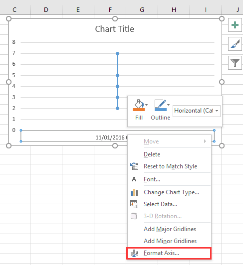
2. 然后在设置坐标轴格式窗格或设置坐标轴格式对话框中,切换到坐标轴选项选项卡,勾选坐标轴类型部分中的文本坐标轴选项。参见截图:
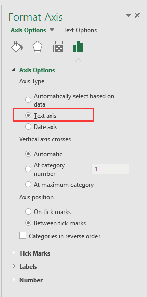
如果您使用的 Excel 版本高于 2010,系统将弹出“设置坐标轴格式”窗格,请在“坐标轴选项”组的“坐标轴类型”下勾选“文本坐标轴”选项。
3. 单击关闭或返回图表后,日期和时间数据将正确显示在 X 轴上。参见截图:
只需两步,即可轻松创建仪表图! |
| 如果您想使用仪表图来展示项目进度,在 Excel 中创建一个可能会既复杂又耗时。而仪表图中的工具可简化此过程,让您仅需两个简单步骤即可创建专业的仪表图。立即下载!。 |
 |
最佳办公效率工具
| 🤖 | KUTOOLS AI 助手:基于以下内容革新数据分析:智能执行 | 生成代码| 创建自定义公式 | 数据分析及生成图表| 调用 Kutools Functions…… |
| 热门功能:查找、高亮或标记重复项 | 删除空白行 | 合并列或单元格且不丢失数据 | 不使用公式的四舍五入…… | |
| 高级 LOOKUP:多条件 VLookup | 多值 VLookup | 跨多工作表 VLookup | 模糊查找…… | |
| 高级下拉列表:快速创建下拉列表 | 级联下拉列表 | 多选下拉列表…… | |
| 列管理器:添加指定数量的列|移动列|切换隐藏列的可见性状态|比较区域与列…… | |
| 特色功能:网格聚焦 | 设计视图 |增强编辑栏 | 工作簿和表管理器 | 资源库(自动文本)| 日期提取 | 汇总工作表 | 加密/解密单元格 | 按列表发送邮件 | 超级筛选 | 特殊筛选(筛选粗体单元格/斜体/删除线……) ...... | |
| 精选 15 工具集:12 文本工具(添加文本,删除特定字符,……)| 50+ 图表 类型(甘特图,……)| 40+ 实用公式(基于生日计算年龄,……)| 19 插入工具(插入二维码,从路径插入图片,……)| 12 转换工具(小写金额转大写,汇率转换,……)| 7 合并和拆分工具(高级合并行,分割单元格,……)|……更多 |
在您的首选语言中使用 Kutools – 支持英语、西班牙语、德语、法语、中文及 40+ 种其他语言!
使用 Kutools for Excel 大幅提升您的 Excel 技能,体验前所未有的高效。Kutools for Excel 提供 300 多项高级功能,助您提升生产力、节省时间。立即点击此处,获取您最需要的功能……
Office Tab 为 Office 带来标签式界面,让您的工作更轻松
- 在 Word、Excel、PowerPoint、Publisher、Access、Visio 和 Project 中启用标签式编辑和阅读。
- 在同一个窗口的新标签页中打开并创建多个文档,而非在新窗口中。
- 将您的工作效率提升 50%,每天减少数百次鼠标点击!
所有 Kutools 插件,一个安装程序
Kutools for Office 套件捆绑了适用于 Excel、Word、Outlook 和 PowerPoint 的插件以及 Office Tab Pro,非常适合需要跨多个 Office 应用高效协作的团队。
- 一体化套件— Excel、Word、Outlook 和 PowerPoint 插件 + Office Tab Pro
- 一个安装程序,一个许可证— 几分钟内完成设置(支持 MSI)
- 协同效果更佳— 在多个 Office 应用中实现高效协同
- 30 天全功能试用— 无需注册,无需信用卡
- 超值之选— 比单独购买插件更省钱