如何在 Excel 中创建速度表或仪表盘图表?
如果您曾分析过绩效指标、服务水平或财务基准,或许会发现速度表(又称仪表盘)图表是一种极具视觉冲击力的方式,能将当前数值与特定范围进行直观对比。这类图表如同汽车仪表盘上的速度表,可一目了然地呈现进度、状态或趋势。尽管 Excel 未直接提供速度表/仪表盘图表类型,但通过以下方法,您仍能高效创建出清晰且动态的报表图表。

借助圆环图创建仪表图
使用强大工具创建快速创建仪表图(3 步骤)
更多图表教程……
借助圆环图创建仪表图
此方法通过巧妙结合圆环图与饼图仪表类型,助您手动打造专属仪表图,尤其适合追求对图表组件(如颜色分区、指针位置及标签布局)实现完全掌控的用户。整个过程包含多个关键步骤,需格外留意数据准备与图表选项设置。
1. 在创建仪表图之前,正确设置辅助数据至关重要,以确保图表分段和指针按预期精准运作,避免最终可视化中出现常见错误。
- 创建第一个数值范围,用于定义仪表图的不同分段。例如,若要将仪表划分为三个扇区(如低、中、高),请在单元格 A2、A3 和 A4 中分别输入 30、60 和 90. 接着,在单元格 A5 中输入这些数值的总和(=30+60+90=180),该合计值代表上述三个单元格的总和,并对图表的正确分段至关重要。
- 准备指针指示器的数值范围:在单独一列(如 D 列)中输入指针值——在 D2 单元格输入 10,D3 单元格输入 5,以生成用于定位的数据点;并在 D4 单元格中输入以下公式,计算图表剩余的圆弧部分:
该公式可确保指针部分在 360 度图表区域中按比例精准呈现。=360-(D2+D3)

3. 选中“数值”列中的数字,转到插入选项卡,点击插入饼图或圆环图,然后选择圆环图,即可将分段的数值范围直观呈现。
4. 右键单击圆环图,选择设置数据系列格式,即可打开格式设置窗格。

5. 在设置数据系列格式窗格中,将第一扇区起始角度设为 271,即可对齐图表起点,显著提升仪表效果的视觉准确性。

5. 右键单击最大的扇区(通常代表背景或不可见的圆弧),从上下文菜单中选择设置数据点格式,即可打开其格式设置窗格。

6. 在设置数据点格式窗格中,转到填充与线条,选择无填充以隐藏该扇区,然后关闭窗格。此操作可移除无需显示的图表部分,让仪表盘更清晰直观。

7. 右键单击圆环图,然后选择选择数据。

8. 在选择数据源对话框中,单击添加即可创建一个附加系列,该系列将作为速度表的指针。

9. 在编辑系列对话框中,为系列命名,选择指针值(D2:D4 单元格),然后单击确定。

10. 返回源区域对话框后,单击确定即可完成数据选择。
11. 右键单击新添加的圆环图扇区(显示为外圈),选择更改系列图表类型。

12. 在所有图表 > 组合图 下,为指针系列选择饼图类型,勾选次坐标轴,然后单击确定。此操作会将指针饼图叠加到圆环图仪表盘上。

13. 单击饼图的指针系列,右键单击后再次选择设置数据系列格式。

14. 在格式设置窗格中,点击系列选项选项卡下的第一扇区起始角度字段,输入数值 270,然后关闭窗格。此操作可精确调整指针相对于仪表盘的位置。

15. 选择最大的饼图扇区,通过将其数据点格式设置为无填充,使其不可见。

16. 在设置数据点格式窗格中,为所有剩余的大扇区选择无填充,即可隐藏不必要的饼图部分。

17. 根据需要重复上述步骤,隐藏其他不必要的饼图扇区或图表元素(如图例、边框或标题),打造清晰直观的仪表盘效果。您的图表现在应呈现出类似速度表的外观:

18. 单击指针扇区,右键单击并选择添加数据标签,即可提升用户可读性。

19. 单击数据标签即可选中,再次单击即可编辑。在编辑栏中输入“=”,然后选择 D2 单元格(指针值),再按 Enter,即可将指针标签链接到工作表,实现动态更新。

每当 D2 单元格的值发生变化,图表指针便会自动更新,为您提供即时反馈。请参见下方演示:

提示:为避免常见问题,请勿在区域中合并单元格,否则可能导致图表出错。务必验证公式引用,并仔细确认“无填充”格式仅应用于正确的扇区,以确保指针正确渲染。此手动方法支持高度自定义,可灵活调整每种颜色与标签,但需投入更多时间与精度,尤其在更新或调整布局时。如希望自动化创建图表,请考虑以下替代方案之一。
使用强大工具创建快速创建仪表图
Kutools for Excel 的快速创建仪表图工具可简化流程并立即生成结果,助您轻松应对手动创建仪表图的复杂与繁琐。只需几步,即可构建动态仪表盘图表,并灵活设置最小值、最大值和当前值参数。其直观界面让初学者也能快速创建和更新仪表图,完美适用于仪表盘、演示文稿及进度可视化。

以下是使用 Kutools 快速创建仪表图的方法:
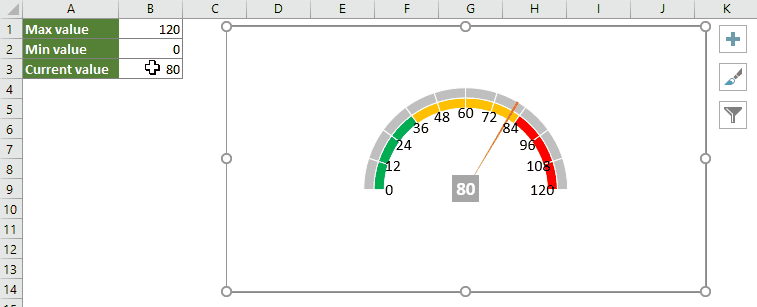
1. 通过设定最大值、最小值和当前值来准备工作表数据,这三个参数将决定仪表盘的显示范围及指针位置。

2. 转到 Kutools 选项卡,依次点击图表 > 进度 > 速度表,即可打开该工具。

3. 在快速创建仪表图对话框中,分别选择包含最大值、最小值和当前值的单元格,再选择您偏好的仪表类型,并可选勾选生成动态图,让指针随数据变化自动更新。单击确定,立即生成图表!

此后,更新当前值将自动移动指针,让您的仪表盘即刻响应。请参见下方演示:
Kutools 提供灵活的图表样式并自动处理格式设置,非常适合用于周期性报告、快速布局,或希望在无需繁琐手动调整的情况下轻松获得专业效果的用户。其主要局限在于,相较于手动设置,对底层格式的控制较为有限。
Kutools for Excel——通过 300 多款必备工具全面增强 Excel 功能,助您工作更快速、更轻松,并借助 AI 功能实现更智能的数据处理与高效办公!立即获取
总结与建议:在选择这些方案时,请综合考虑您的报告频率、所需的自定义程度以及技术熟练度。若追求深度自定义并希望掌握 Excel 图表机制,手动创建圆环图是理想之选;而若想以最少操作快速生成即时、动态的仪表板,Kutools 则是更高效的选择。
最佳办公效率工具
| 🤖 | KUTOOLS AI 助手:基于以下内容革新数据分析:智能执行 | 生成代码| 创建自定义公式 | 数据分析及生成图表| 调用 Kutools Functions…… |
| 热门功能:查找、高亮或标记重复项 | 删除空白行 | 合并列或单元格且不丢失数据 | 不使用公式的四舍五入…… | |
| 高级 LOOKUP:多条件 VLookup | 多值 VLookup | 跨多工作表 VLookup | 模糊查找…… | |
| 高级下拉列表:快速创建下拉列表 | 级联下拉列表 | 多选下拉列表…… | |
| 列管理器:添加指定数量的列|移动列|切换隐藏列的可见性状态|比较区域与列…… | |
| 特色功能:网格聚焦 | 设计视图 |增强编辑栏 | 工作簿和表管理器 | 资源库(自动文本)| 日期提取 | 汇总工作表 | 加密/解密单元格 | 按列表发送邮件 | 超级筛选 | 特殊筛选(筛选粗体单元格/斜体/删除线……) ...... | |
| 精选 15 工具集:12 文本工具(添加文本,删除特定字符,……)| 50+ 图表 类型(甘特图,……)| 40+ 实用公式(基于生日计算年龄,……)| 19 插入工具(插入二维码,从路径插入图片,……)| 12 转换工具(小写金额转大写,汇率转换,……)| 7 合并和拆分工具(高级合并行,分割单元格,……)|……更多 |
使用 Kutools for Excel 大幅提升您的 Excel 技能,体验前所未有的高效。Kutools for Excel 提供 300 多项高级功能,助您提升生产力、节省时间。立即点击此处,获取您最需要的功能……
Office Tab 为 Office 带来标签式界面,让您的工作更轻松
- 在 Word、Excel、PowerPoint、Publisher、Access、Visio 和 Project 中启用标签式编辑和阅读。
- 在同一个窗口的新标签页中打开并创建多个文档,而非在新窗口中。
- 将您的工作效率提升 50%,每天减少数百次鼠标点击!
所有 Kutools 插件,一个安装程序
Kutools for Office 套件捆绑了适用于 Excel、Word、Outlook 和 PowerPoint 的插件以及 Office Tab Pro,非常适合需要跨多个 Office 应用高效协作的团队。
- 一体化套件— Excel、Word、Outlook 和 PowerPoint 插件 + Office Tab Pro
- 一个安装程序,一个许可证— 几分钟内完成设置(支持 MSI)
- 协同效果更佳— 在多个 Office 应用中实现高效协同
- 30 天全功能试用— 无需注册,无需信用卡
- 超值之选— 比单独购买插件更省钱