在 Excel 中根据数值更改图表颜色
有时,插入图表后,您可能希望图表中不同数值范围以不同颜色呈现。例如,数值在 0–60 时显示为蓝色,71–80 时显示为灰色,81–90 时显示为黄色,依此类推(如下图所示)。本教程将为您介绍如何在 Excel 中根据数值自动更改图表颜色。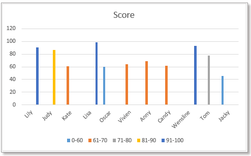
根据数值更改柱形/条形图表颜色
方法 1:使用公式和内置图表功能更改柱形图颜色
方法 2:使用便捷工具更改柱形图颜色
首先,您需要按照下图所示创建数据:列出每个数值范围,并在数据右侧将这些数值范围作为列标题插入。
1. 在单元格 C5 中输入以下公式:
然后向下拖动填充柄填充单元格,再向右继续拖动填充柄。
2. 接着选择列名称,按住 Ctrl 键,再选择包含数值范围标题的公式单元格。
3. 单击“插入”>“插入柱形图或条形图”,根据需求选择“簇状柱形图”或“簇状条形图”。
图表现已插入,其颜色将随数值变化而自动调整。
有时,使用公式创建图表可能会因公式出错或被删除而引发问题。现在,Kutools for Excel 的“按数值更改图表颜色”功能可助您轻松应对!
免费安装 Kutools for Excel 后,请按以下步骤操作:
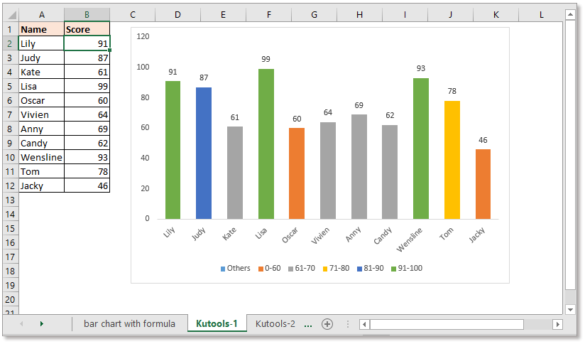
1. 单击“Kutools”>“图表”>“按数值更改图表颜色”。如下图所示:
2. 在弹出的对话框中,请执行以下操作:
1)请选择所需的仪表类型,然后分别选择轴标签区域和系列值(不含列标题)。
2)然后点击功能区上的“添加”按钮 ,按需添加数值范围。
3)重复上述步骤,将所有数值范围添加到“分组”列表中,然后单击“确定”。
提示:
1. 双击柱形或条形,即可打开“设置数据点格式”窗格,轻松更改颜色。
2. 如果之前已插入柱形图或条形图,您可使用“按值填充图表颜色”工具,根据数值自动调整图表颜色。
选择条形图或柱状图,然后单击“Kutools”>“图表”>“按值填充图表颜色”。在弹出的对话框中,按需设置数值范围及其对应颜色。立即免费下载!
若要插入根据数值显示不同颜色的折线图,您需要使用另一个公式。
首先,您需要按照下图所示创建数据:列出每个数值范围,并在其右侧将该数值范围作为列标题插入。
注意:系列数值必须按 A 到 Z 的顺序排序。
1. 在单元格 C5 中输入以下公式:
然后向下拖动填充柄以填充单元格,再向右继续拖动填充柄。
3. 请选择包含数值范围标题及公式单元格的数据区域,如下图所示:
4. 单击“插入”>“插入折线图或面积图”,然后选择“折线图”类型。
现在,您已成功创建了一张能根据数值自动显示不同颜色折线的折线图。
在 Excel 中使用系列选择复选框创建交互式图表
在 Excel 中,我们通常通过插入图表更清晰地展示数据,而图表有时包含多个数据系列。此时,您可通过勾选复选框,轻松显示特定系列,打造更灵活的交互式图表体验!
使用条件格式制作堆积条形图(Excel 版)
本教程将逐步指导您在 Excel 中创建如下图所示的条件格式堆积条形图。
在 Excel 中逐步创建实际值与预算值对比图表
本教程将逐步指导您在 Excel 中创建如下图所示的条件格式堆积条形图。
- 超级编辑栏(轻松编辑多行文本和公式);阅读版式(轻松阅读和编辑大量单元格);粘贴到筛选范围……
- 合并单元格/行/列并保留数据;分割单元格内容;合并重复行并求和/求平均值……防止重复项单元格;比较区域……
- 选择重复或唯一行;选择空白行(所有单元格均为空);超级查找和模糊查找多个工作簿中的内容;随机选择……
- 精准公式复制多个单元格而不更改公式引用;自动创建引用到多个工作表;插入项目符号、复选框等更多功能……
- 收藏并快速插入公式、区域、图表和图片;加密单元格并设置密码;创建邮件列表并发送电子邮件……
- 提取文本、添加文本、删除某位置字符、删除空格;创建并打印数据分页统计;在单元格内容与批注之间转换……
- 超级筛选(保存并应用筛选方案到其他工作表);高级排序按月/周/日、频率等分组;特殊筛选按加粗、倾斜等格式……
- 合并工作簿和工作表;汇总表格基于关键列;分割数据到多个工作表;批量转换 xls、xlsx 和 PDF……
- 数据透视表按周数、星期几等分组……显示未锁定、选区锁定并以不同颜色标识;高亮显示包含公式/名称的单元格……
")
- 在 Word、Excel、PowerPoint、Publisher、Access、Visio 和 Project 中启用标签式编辑与阅读,大幅提升多文档操作效率!
- 在同一个窗口的新标签页中打开并创建多个文档,而非在新窗口中操作。
- 将您的工作效率提升 50%,每天减少数百次鼠标点击!
")