如何在 Excel 中为图表中的各个数据点设置不同颜色?
在 Excel 中创建单一系列的柱形图、条形图或折线图时,您会发现所有数据点默认采用同一种颜色显示。这种统一的配色方案虽然简洁,却可能让图表显得不够吸睛,也难以快速区分各个数据值。许多用户都希望自定义图表,为每个数据点赋予独特颜色,从而提升视觉吸引力与专业感,同时让数据趋势、异常值或关键类别一目了然,更易于解读。
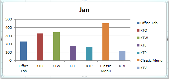
然而,如果您尝试通过标准格式选项更改单个数据点的颜色,会发现 Excel 会将颜色更改应用到整个数据系列,而非仅限于所选数据点。当您希望实现如下所示的视觉效果时,这种限制可能会令人沮丧:
 |
 |
 |
本文将为您介绍几种实用的解决方案,助您在图表中为每个数据点轻松实现多色效果——既涵盖 Excel 内置功能,也包括使用 VBA 代码的高级方法。借助这些技巧,您不仅能更高效地传达数据信息,还能让图表在演示文稿或报告中脱颖而出。
为柱形图 / 条形图 / 折线图按点变化颜色
如果您希望手动为柱形图、条形图或折线图中的每个数据点赋予不同颜色,Excel 的“按点变化颜色”功能可为单一系列图表提供快速高效的解决方案。当数据点数量较少,且您希望迅速区分各个数值时,这一功能尤为实用。不过,该功能无法实现完全自由的颜色自定义,因其受限于 Excel 的默认调色板与主题设置。
要为每个数据点设置不同颜色,请按以下步骤操作:
1. 首先,单击图表中的任意一个数据柱(或数据点)以选中整个数据系列;然后右键单击打开上下文菜单,并选择设置数据系列格式。如果在选择单个系列时遇到问题,请确保单击(而非双击)数据点。

2. 在设置数据系列格式对话框中,单击左侧窗格中的填充,然后在右侧区域勾选按点变化颜色复选框,即可立即为系列中的每个数据点分配不同的默认主题颜色。

提示:如果您使用的是 Excel 2013 或更高版本,界面可能略有不同。在设置数据系列格式窗格中,点击填充与线条图标(油漆桶)。在填充部分下,即可找到相同的按点变化颜色选项。勾选该选项即可应用设置。参见截图:

3. 在单击关闭退出对话框后,您的图表将为每个数据点显示不同颜色。请注意,所分配的颜色基于当前工作簿主题。
4. 如果您不满意默认配色,可通过自定义主题轻松调整——转到页面布局选项卡,单击主题,即可选择心仪的颜色主题,所有图表颜色将自动同步更新!快速试出契合演示风格或品牌调性的完美配色方案,就是这么简单。

5. 更改主题后,您的图表将立即以所选新调色板显示数据条或数据柱。
使用技巧:
• “按点变化颜色”选项不仅适用于柱状图,还可用于条形图和 Excel 中的折线图。
• 虽然“按点变化颜色”在基础图表中操作简单快捷,但无法精确控制每个数据点的颜色。如需使用特定品牌色,或为每个数值指定专属颜色,建议手动格式化各数据点,或采用以下更高级的方法。
• 此功能仅支持单一系列图表。对于多系列复杂图表或需精细调控颜色的场景,请参阅以下扩展解决方案。
故障排除:
• 如果“按点变化颜色”选项呈灰色不可用,请检查图表中是否包含多个数据系列——此选项仅适用于单一系列图表。
• 在某些较旧版本的 Excel 中,功能名称或图标可能略有不同;将鼠标悬停在类似选项上即可快速定位该功能。
• 若图表未立即更新,请尝试重新单击图表或刷新工作表。
总结建议:当您需要为小型数据集中的每个数据点快速、简便地实现颜色变化,且无需为各点单独设置配色方案时,推荐使用此方法。
VBA:为图表数据点分配自定义颜色
在某些场景下,Excel 内置的“按点变化颜色”功能或图表主题不够精确——例如,当您希望为每个数据点应用特定颜色以实现高级可视化效果(如匹配品牌色、突出异常值或使用标准化色码)时。此时,您可以使用 VBA 以编程方式设置每个数据点的颜色。当您拥有大型数据集或需要重复应用自定义颜色时,此方法尤为实用。
适用场景:当您需要为每个数据点精确分配颜色(包括 RGB 或十六进制代码),或希望自动应用颜色而无需手动逐个格式化时,即可使用。唯一限制是需启用宏安全权限,且编辑宏代码需具备一定的 VBA 基础。
1. 单击开发工具 > Visual Basic。在新打开的 Microsoft Visual Basic for Applications 窗口中,单击插入 > 模块,并将以下代码输入到模块中:
Sub SetChartPointColors()
    ' Assigns custom colors to each data point in the first series of the first chart on the active sheet
    Dim cht As ChartObject
    Dim i As Integer
    Dim colorArray As Variant

    ' Define custom color codes (RGB values or color constants)
    colorArray = Array(RGB(255, 0, 0), RGB(0, 176, 80), RGB(0, 112, 192), RGB(255, 192, 0), RGB(112, 48, 160))

    On Error Resume Next
    Set cht = ActiveSheet.ChartObjects(1)

    If cht Is Nothing Then
        xTitleId = "KutoolsforExcel"
        MsgBox "No chart found on the active sheet.", vbExclamation, xTitleId
        Exit Sub
    End If

    For i = 1 To cht.Chart.SeriesCollection(1).Points.Count
        cht.Chart.SeriesCollection(1).Points(i).Format.Fill.ForeColor.RGB = colorArray((i - 1) Mod UBound(colorArray) + 1)
    Next i

    MsgBox "Custom colors have been assigned to data points.", vbInformation, xTitleId
End Sub
参数说明与自定义技巧:
•colorArray 用于存储您要分配给各数据点的颜色值。您可以直接编辑这些 RGB 元组,精准匹配您的配色需求。
•ActiveSheet.ChartObjects(1) 指向活动工作表中的第一个图表对象。若工作表包含多个图表,请根据实际情况调整此引用。
2. 要运行代码,请单击 VBA 中的![]() 按钮,或按 F5 键。宏会将您的自定义调色板应用到图表第一个系列的每个数据点;若数据点数量超过颜色数组中的颜色数量,宏将循环使用这些颜色。
按钮,或按 F5 键。宏会将您的自定义调色板应用到图表第一个系列的每个数据点;若数据点数量超过颜色数组中的颜色数量,宏将循环使用这些颜色。
注意事项与故障排除:
• 请确保在 Excel 设置中已启用宏权限,因为宏默认处于禁用状态。
• 若提示“未找到图表”,请先激活包含目标图表的工作表。
• RGB 颜色可根据需求灵活调整,可使用 Excel 自带的取色器或在线工具快速获取您偏好的 RGB 代码。
• 您还可进一步优化 VBA 代码,例如添加颜色选择提示,或指定对特定图表/数据系列执行操作。
总结建议:当您需要自动化或精准控制数据点着色时(尤其是图表频繁更新或包含大量数值的情况下),VBA 方法最为适用。
最佳办公效率工具
| 🤖 | KUTOOLS AI 助手:基于以下内容革新数据分析:智能执行 | 生成代码| 创建自定义公式 | 数据分析及生成图表| 调用 Kutools Functions…… |
| 热门功能:查找、高亮或标记重复项 | 删除空白行 | 合并列或单元格且不丢失数据 | 不使用公式的四舍五入…… | |
| 高级 LOOKUP:多条件 VLookup | 多值 VLookup | 跨多工作表 VLookup | 模糊查找…… | |
| 高级下拉列表:快速创建下拉列表 | 级联下拉列表 | 多选下拉列表…… | |
| 列管理器:添加指定数量的列|移动列|切换隐藏列的可见性状态|比较区域与列…… | |
| 特色功能:网格聚焦 | 设计视图 |增强编辑栏 | 工作簿和表管理器 | 资源库(自动文本)| 日期提取 | 汇总工作表 | 加密/解密单元格 | 按列表发送邮件 | 超级筛选 | 特殊筛选(筛选粗体单元格/斜体/删除线……) ...... | |
| 精选 15 工具集:12 文本工具(添加文本,删除特定字符,……)| 50+ 图表 类型(甘特图,……)| 40+ 实用公式(基于生日计算年龄,……)| 19 插入工具(插入二维码,从路径插入图片,……)| 12 转换工具(小写金额转大写,汇率转换,……)| 7 合并和拆分工具(高级合并行,分割单元格,……)|……更多 |
使用 Kutools for Excel 大幅提升您的 Excel 技能,体验前所未有的高效。Kutools for Excel 提供 300 多项高级功能,助您提升生产力、节省时间。立即点击此处,获取您最需要的功能……
Office Tab 为 Office 带来标签式界面,让您的工作更轻松
- 在 Word、Excel、PowerPoint、Publisher、Access、Visio 和 Project 中启用标签式编辑和阅读。
- 在同一个窗口的新标签页中打开并创建多个文档,而非在新窗口中。
- 将您的工作效率提升 50%,每天减少数百次鼠标点击!
所有 Kutools 插件,一个安装程序
Kutools for Office 套件捆绑了适用于 Excel、Word、Outlook 和 PowerPoint 的插件以及 Office Tab Pro,非常适合需要跨多个 Office 应用高效协作的团队。
- 一体化套件— Excel、Word、Outlook 和 PowerPoint 插件 + Office Tab Pro
- 一个安装程序,一个许可证— 几分钟内完成设置(支持 MSI)
- 协同效果更佳— 在多个 Office 应用中实现高效协同
- 30 天全功能试用— 无需注册,无需信用卡
- 超值之选— 比单独购买插件更省钱